
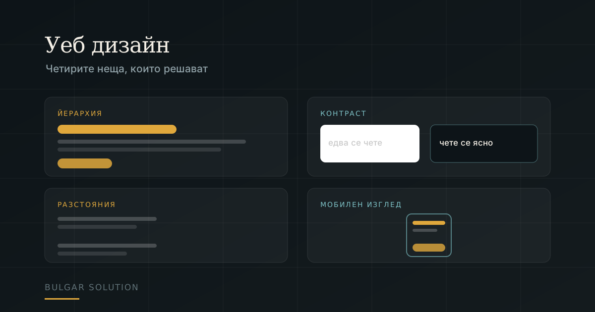
'I want a modern design' is the most common sentence in a first conversation. The trouble is that modern ages in two years, while the things that make a visitor stay and call do not change at all.
1. Hierarchy: where the eye goes first
Open your homepage and ask: if I had two seconds, what would I read? If the answer is 'I don't know' or 'the logo', the page has no hierarchy. One thing should be obviously the most important — usually what you offer and to whom.
- One headline saying what you do, in the customer's words rather than your internal terms.
- One primary action. Five identical-looking buttons are zero actions.
- Everything else visibly smaller. If everything is emphasised, nothing is.
2. Contrast: can it be read outdoors
Light grey on white looks refined on your office monitor. On a phone in sunlight it is invisible. This is not a matter of taste — it is measurable and it has a threshold.
Check your colours with the contrast checker. For body text the minimum is 4.5:1. If it fails, darken the text — a five-minute change with a disproportionate effect on readability.
3. Spacing: the most underrated tool
Amateur design gives itself away through spacing, not colour. The rule is simple and almost always broken: related things sit close together, unrelated things far apart. If a heading is equidistant from the text above and below, the reader cannot tell what it belongs to.
If you are unsure whether to add an element, remove two. White space is not wasted space — it is what makes everything else readable.
4. The mobile view is the real view
Google indexes the mobile version of your site, and most Bulgarian traffic arrives on a phone. If the design was made on a 27-inch monitor and then 'shrunk', it shows.
- Tap targets at least 44 pixels tall — a thumb is not a cursor.
- The phone number as a link that dials on tap.
- Form fields with the right input type, so the right keyboard appears.
- No horizontal scrolling. Ever.
And one thing that is not design but ruins it
Speed. The most beautiful homepage is useless if it takes eight seconds — the visitor leaves before seeing it. Work out your weight with the page weight budget and see how long your customer waits on mobile.
Frequently asked questions about web design
What does a website cost?
From €200 for a brochure site to €950 for an online store. Work out your case with the calculator or see the website packages.
How long does it take?
Usually 7 – 10 days for a brochure site. An online store or a more complex project takes several weeks, depending on scope.
Can I edit the site myself afterwards?
Yes. We hand over an admin panel and training on adding pages, images and copy without calling us about every detail.
Do I need a new site or just a redesign?
If the structure and URLs work and only the look has aged — a redesign. If the site is slow, not mobile and cannot be maintained, a new one costs less than patching.
Do you do logos too?
Yes — see logo design or the full digital brand book.